Discover the Ultimate Invoice Website for Quality Assurance

Effortlessly send and eSign documents with airSlate SignNow's user-friendly, cost-effective solutions. Enhance your workflow and ensure seamless quality assurance for your business.

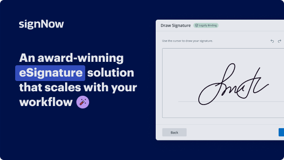
Award-winning eSignature solution

Send my document for signature

Get your document eSigned by multiple recipients.
Send my document for signature

Sign my own document

Add your eSignature
to a document in a few clicks.
Sign my own document

Move your business forward with the airSlate SignNow eSignature solution

Add your legally binding signature

Create your signature in seconds on any desktop computer or mobile device, even while offline. Type, draw, or upload an image of your signature.

Integrate via API

Deliver a seamless eSignature experience from any website, CRM, or custom app — anywhere and anytime.

Send conditional documents

Organize multiple documents in groups and automatically route them for recipients in a role-based order.

Share documents via an invite link

Collect signatures faster by sharing your documents with multiple recipients via a link — no need to add recipient email addresses.

Save time with reusable templates

Create unlimited templates of your most-used documents. Make your templates easy to complete by adding customizable fillable fields.

Improve team collaboration

Create teams within airSlate SignNow to securely collaborate on documents and templates. Send the approved version to every signer.

See airSlate SignNow eSignatures in action

Create secure and intuitive eSignature workflows on any device, track the status of documents right in your account, build online fillable forms – all within a single solution.

Try airSlate SignNow with a sample document

Complete a sample document online. Experience airSlate SignNow's intuitive interface and easy-to-use tools
in action. Open a sample document to add a signature, date, text, upload attachments, and test other useful functionality.

sample
Checkboxes and radio buttons
sample
Request an attachment
sample
Set up data validation

airSlate SignNow solutions for better efficiency

Keep contracts protected
Enhance your document security and keep contracts safe from unauthorized access with dual-factor authentication options. Ask your recipients to prove their identity before opening a contract to invoice website for quality assurance.
Stay mobile while eSigning
Install the airSlate SignNow app on your iOS or Android device and close deals from anywhere, 24/7. Work with forms and contracts even offline and invoice website for quality assurance later when your internet connection is restored.
Integrate eSignatures into your business apps
Incorporate airSlate SignNow into your business applications to quickly invoice website for quality assurance without switching between windows and tabs. Benefit from airSlate SignNow integrations to save time and effort while eSigning forms in just a few clicks.
Generate fillable forms with smart fields
Update any document with fillable fields, make them required or optional, or add conditions for them to appear. Make sure signers complete your form correctly by assigning roles to fields.
Close deals and get paid promptly
Collect documents from clients and partners in minutes instead of weeks. Ask your signers to invoice website for quality assurance and include a charge request field to your sample to automatically collect payments during the contract signing.
Collect signatures
24x
faster
Reduce costs by
$30
per document
Save up to
40h
per employee / month

Our user reviews speak for themselves

illustrations persone
Kodi-Marie Evans
Director of NetSuite Operations at Xerox
airSlate SignNow provides us with the flexibility needed to get the right signatures on the right documents, in the right formats, based on our integration with NetSuite.
illustrations reviews slider
illustrations persone
Samantha Jo
Enterprise Client Partner at Yelp
airSlate SignNow has made life easier for me. It has been huge to have the ability to sign contracts on-the-go! It is now less stressful to get things done efficiently and promptly.
illustrations reviews slider
illustrations persone
Megan Bond
Digital marketing management at Electrolux
This software has added to our business value. I have got rid of the repetitive tasks. I am capable of creating the mobile native web forms. Now I can easily make payment contracts through a fair channel and their management is very easy.
illustrations reviews slider
walmart logo
exonMobil logo
apple logo
comcast logo
facebook logo
FedEx logo
be ready to get more

Why choose airSlate SignNow

  • Free 7-day trial. Choose the plan you need and try it risk-free.
  • Honest pricing for full-featured plans. airSlate SignNow offers subscription plans with no overages or hidden fees at renewal.
  • Enterprise-grade security. airSlate SignNow helps you comply with global security standards.
illustrations signature

How to use an invoice website for Quality Assurance: airSlate SignNow benefits

In today's digital age, ensuring the integrity of your documents is vital, especially for businesses focusing on Quality Assurance. Using an invoice website for Quality Assurance, like airSlate SignNow, streamlines the signing process, allowing you to manage documents with ease and efficiency. This guide will walk you through utilizing airSlate SignNow, highlighting its benefits along the way.

Steps to utilize an invoice website for Quality Assurance: airSlate SignNow benefits

  1. Open your browser and navigate to the airSlate SignNow homepage.
  2. Create an account with a free trial or log in to your existing account.
  3. Select the document you need to sign or choose one you want to send out for signatures.
  4. Opt to convert your document into a reusable template for future use.
  5. Access the file to make necessary modifications, such as inserting fillable fields or other information.
  6. Place your signature on the document and designate signature fields for your recipients.
  7. Proceed by clicking Continue to configure and send your eSignature request.

airSlate SignNow offers impressive advantages for businesses looking to enhance their document management processes. With a rich feature set designed for a reasonable cost, it fosters a great return on investment. Moreover, its user-friendly interface is tailored specifically for small to mid-sized businesses, simplifying scaling efforts.

Additionally, airSlate SignNow boasts transparent pricing with no unexpected fees, ensuring that budget planning is stress-free. Its dedicated 24/7 support provides assistance for all paying users, enhancing your overall experience. Start leveraging airSlate SignNow for your document needs today and witness the transformative benefits it can bring to your Quality Assurance processes!

How it works

Open & edit your documents online
Create legally-binding eSignatures
Store and share documents securely

airSlate SignNow features that users love

Speed up your paper-based processes with an easy-to-use eSignature solution.

Edit PDFs
online
Generate templates of your most used documents for signing and completion.
Create a signing link
Share a document via a link without the need to add recipient emails.
Assign roles to signers
Organize complex signing workflows by adding multiple signers and assigning roles.
Create a document template
Create teams to collaborate on documents and templates in real time.
Add Signature fields
Get accurate signatures exactly where you need them using signature fields.
Archive documents in bulk
Save time by archiving multiple documents at once.
be ready to get more

Get legally-binding signatures now!

FAQs

Here is a list of the most common customer questions. If you can’t find an answer to your question, please don’t hesitate to reach out to us.

Need help? Contact support

What active users are saying — invoice website for quality assurance

Get access to airSlate SignNow’s reviews, our customers’ advice, and their stories. Hear from real users and what they say about features for generating and signing docs.

This service is really great! It has helped...
5
anonymous

This service is really great! It has helped us enormously by ensuring we are fully covered in our agreements. We are on a 100% for collecting on our jobs, from a previous 60-70%. I recommend this to everyone.

Read full review
I've been using airSlate SignNow for years (since it...
5
Susan S

I've been using airSlate SignNow for years (since it was CudaSign). I started using airSlate SignNow for real estate as it was easier for my clients to use. I now use it in my business for employement and onboarding docs.

Read full review
Everything has been great, really easy to incorporate...
5
Liam R

Everything has been great, really easy to incorporate into my business. And the clients who have used your software so far have said it is very easy to complete the necessary signatures.

Read full review

Related searches to Discover the ultimate invoice website for Quality Assurance

Invoice website for quality assurance template
Free invoice website for quality assurance
Best invoice website for quality assurance
Zoho Invoice
Free invoice software download
Invoicing software for small business free
Invoice Ninja
Zoho Invoice download
video background

Invoice website for Quality Assurance

has the site been tested in all major browsers so we'll typically do safari we'll do firefox we usually work in chrome and edge and then um you could also throw in opera if you want but what we like to do in every single browser is just go to the main page you know take a good look at the home page to make sure that all works um check anything that's like fancy css or special functionality like animation or javascript um anything where you had to write a lot of css or something that might not be supported in other browsers always double check and then we'll just do like a quick scroll through you know the main pages and i always like to look at all of the different types of pages so for example if they have a blog always look at the the blog pages too because they just are laid out differently have some different kind of functionality so we'll just click through kind of every different page every different type of page and just do a quick look to make sure that it looks good and there's nothing broken in any of the browsers okay do the phone numbers and email addresses have hyperlinks so we talked about that a moment we like to link every phone number with the tel colon you can see that's done in the footer but not in the top area this just allows people on mobile to just click on that and dial instead of having to copy and paste the phone number or do any kind of manual labor there um next on the list are the forms easy and intuitive to fill out so here's a form right here we like to just click in there and start typing now this is something that's really common with page builders you can see there is text there but it's actually white and probably what happened was that we were using the theme customizer or you know the the color pickers in the back end and we wanted to make all this white text and then it also made the text in here white so that's just something to look out for um you always want to just make sure that the text is easy to read we'll look at some other forms here on the contact page um typing in here to see what it looks like contrast is not nearly strong enough here we'll talk about color contrast a little bit later but this is not easy to read not easy to fill out there's some really weird alignment here that's sort of confusing um so this is this is an example of what i would say is a bad form we'd want to tighten that up and do a little bit more designing there are the instructions on the forms easy clear do they contain all the necessary information so making sure that there's labels you can see the phone number is missing a label um this field is also really long which kind of makes it look like it's not a phone number field there's a lot of things with form usability that we have on our qa list because the forms are a lot of times the most important part of the website that's the part where they're actually getting a lead or they're getting someone's contact information who wants services or products and so we like to spend a lot of time looking at the forms and optimizing them for usability um had the validated fields been tested so what happens if you hit submit and you didn't fill out all of the form fields do is it obvious to the user what to fix so this is good um this obviously looks broken so we'd want to style that so it looks better um and then have thank you pages been created for each form so this is something we like to do partly for google analytics tracking but also partly just because it's a great usability feature if you fill out a form and you hit submit um you want to make sure that there's something dramatic that happens once you fill out the form having a separate url makes it more trackable in google analytics so we always like to have thank you pages set up for each one of our forms are the form notifications getting sent to the recipients and are the messages correct so setting up the confirmations and the notifications with the forms is something that is super important again probably the most important part of the website and something that a lot of people just kind of forget to test later to make sure that the emails go through if you built a website form ever in wordpress you know that the email deliverability is not a guarantee so depending on the host and the the domain authority and all of those things you could actually have problems where the client's not getting the form notifications so absolutely make sure you test those make sure that the client replies to the form and that the person who filled it out gets it because that's another kind of a tricky thing when you're setting up the forms um to get right and always make sure that you're testing that um does the newsletter form feed into the email marketing so this is a mailchimp setup and we use gravity forms that have a mailchimp feed on here um no matter what the email software is you need to actually test this sign up go into the email software and make sure that it worked sometimes there's like a double opt-in you know make sure that you have that set up how you want it um and then it actually works again it's easy to build a form on a website it takes a lot of time to make sure that the actual forms are working correctly has all the special page plug-in functionality been tested thoroughly so if you have e-commerce booking a calendar any kind of lms that will probably need its own quality assurance process because there's so much involved with e-commerce that you'll want to have a whole separate checklist just for those type of plugins if it's something that's really basic um you know just make sure you're checking that the plugin works how you meant it to okay as the ssl ssl installed correctly with no mixed content warnings right now we are on a demo flywheel site so we are actually showing that the ssl works even though i know it's not really set up but something that's a quick trick i like to do if you are if you have an ssl installed but you are getting mixed content warnings some some of the things that will cause that are if you hard coded an image in the css and you use the full url that doesn't have the s um or something like this in a lot of page builders you'll see like an upload field and if you're using if you start with like a demo site a lot of times those don't get swapped out when you do the migration and you'll need to either manually add the s in there or maybe this whole domain that's got swapped out so you'll need to change that whenever you're using css it's a good practice to just um instead of putting the full url just start with the slash wp content to call an image that way if the domain changes or if the ssl status changes it's not going to throw errors for you let me just see if there's any in here yeah here's an example where we don't have the full url it's just a an abbreviated one that will always work no matter what the domain is do both the version and the non- version work um we just literally type in you know this to a browser and get rid of that to make sure that it works so again because we're on a demo site that does not work um but it is a different dns record and some hosts will set those up automatically for you sometimes you have to manually go and put the cname in there to point to the main domain and make sure that it's resolving to the same place had the site files and database been backed up and stored in a secure place so having backups is super important during the process and then after the process for security you really want those files to actually be downloaded somewhere off-site so not just make a duplicate of the site and save it there in your you know bluehost account or whatever it's a good practice to actually download those somewhere else so that if the server or the site were to get then the backup is is clean and you know that it hasn't been um compromised okay does the search function work properly i'm not sure that we have a search on this site um but just type something in hit enter and see what shows up you should have a built-in wordpress search at the very least and we like to always have if there's nothing come comes up have you know the search there again or some some language about how to find the content you're looking for um does the 404 page work so a way to test this is just to test your url slash and then put in a bunch of garbage and see what happens and here's our 404 page and making sure that here there's a search bar that's good and then has the css been validated or checked for errors so something that's really easy to do um is use a tool like css lint there's a whole bunch of them i just like this one for some reason they verbally abuse you a little bit as well as show whether your code has any errors or not let's see i'm just going to copy and paste that in here hit lint and you'll see here there's one error and 115 warnings they give you a bunch of warnings if it's like not best css practices but the errors are actually what we want to look at so you can see express expected right brace at line 14 column 17 so you can go in here and look here they caught that there is no semicolon right after that a lot of browsers will make up for little mistakes like that but some of them won't and sometimes if you're seeing some things that look different in edge versus chrome it's because of an error in your code and so it's super quick to do and you know make sure that you just don't have any pure errors you can go through the other things if you want but the errors could cause problems so that is for our functionality we're done with that section now we're going to go through the content um the the first thing on our list is has all the sample data and dummy text been removed so a good practice when you are building websites is to use lorem ipsum that is a you've probably seen it around it kind of looks like latin but it's not actually a real name it's just used for typography and placeholder text because it's very obviously not real text when you are using layouts built in you know a from a different website or like you're buying a layout from a library it's a little bit dangerous to have all that demo content in there when it looks like real content because it's a lot less likely that someone will notice it um we use a lorem ipsum it's called cupcake ipsum i think yeah cupcake if some it's pretty funny we just think it's funny but basically it's just a bunch of like words that are desserts and so a quick way for us because we use that we can just do a control f on our keyboard and search for the word cake and if we have accidentally left some lorem ipsum on the site we will be able to quickly find it um so it's just a practice to get used to like not typing real words or not putting you know duplicate content in here old content it's better to replace with laura mipson because someone will more likely catch that error than if it was like outdated content but it looks real is the contact information obvious and correct so in this site yeah we've got some nice contact info right at the top we've got it there we've got it on the contact page um we'll talk about the color contrast again later this is is not very easy to read um and something that happens a lot during websites is the customer will tell us an email address at the beginning of the day and then by the end of the day they've decided to create a new email address so the email addresses on the website again are a super important part of the website the forward-facing ones and also who's getting those notifications so if anyone ever changes the email address in mid-web design just make sure you take the time to ensure that you've changed it everywhere a lot of times web designers don't think that's their job to read the text but we disagree and we think that everyone should read the text on the websites that they're building a because to check for mistakes but b so they actually understand what it is they're building and they can help their customers better um is the layout consistent so this is something where you know we already noted we've got some inconsistent photos here i can hardly handle it when there are four columns and they all have way different lengths we always try to get that tightened up to have the same amount of text with each one um and then another thing that we like to do is just look at the type of pages that there are so we have all these product pages and for some reason we've decided these ones say union made promotional products union made t-shirts union made and then this one is just plaques and awards so that's a consistency thing that we'd like to tighten up and then visually it's a good idea to look at all these similar pages to see if they are laid out the same so this looks you know we start with the orange title and we've got some small photos and some buttons that's great this looks sort of similar um and then all of a sudden we have this one and i'm not really sure who these people are but they're not a t-shirt and apparel so that's not a great photo for that page and it doesn't look like the other pages and then the signs and banners page and that one looks more like the other pages but we'll talk again about that huge wall of text in a moment are there strong noticeable calls to action so i think this website does a good job of that they're using buttons mostly instead of um text links so there's a lot of calls to action here like emailing and call so that's good is there anything missing from the content you would be able to go back through your website contract with them to make sure you did everything you said you were going to um that's something that the client will also help you with if you forgot something they will probably tell you and is everything laid out uh logically and intuitive the kind of thing we're looking for here is like if the con contact us page we're right in the middle of these product pages that's not very intuitive like it's very intuitive to have the contact on the far right people know that that's where to look for that button and you don't want to break up like things um so just having things you know thinking about it as a user and where would you expect to find things it's best generally not to get terribly creative with the way things are navigated because using norms is a good way to help your users find things quickly um does the sidebar content make sense for the page content so if you're using a page builder a lot of times you won't have a traditional wordpress sidebar where you see those a lot are on the blog and the product pages if you're using woocommerce and a lot of times people will just have like either nothing in the sidebar or they'll have the out of the box wordpress stuff with like the login which will get spammed like nobody's business and other things that they shouldn't have on there so just double check that you actually have sidebar items that make sense all right now we're moving on to craftsmanship the first thing is the logo crisp and easy to read these folks have a really nice big bold logo really easy to read um a lot of times when logos have very fine writing like if this promotions was really little or it was a much lighter font the smaller it is the more difficult it can get to read and we've found almost exclusively if the if this logo has small type or a very fine font we almost always need to use an svg file instead of a ping or instead of a jpeg so we just pretty much make a practice of that in this case i think it's a ping and it worked fine because it's a nice big bold logo has the fave icon been added so you can see up here there is no fave icon um that's just a little tiny detail but it actually does help you usability quite a bit does the website match the brand guidelines a lot of customers don't have brand guidelines um but at the very least we want to make sure we're using the same color of orange from the logo you know using the same color of gray from the logo and keeping things as consistent as possible between like if these people have a brochure that they already had printed before they did a website just making sure that things look consistent do the links and buttons stand out and look different than the bold so again they're using lots of nice big buttons that's great um here's an example of where there's there's bold text and there's linked text and it's good that they look different you can tell if they were both bold and black you wouldn't be able to tell that one is a link and one is just bold is there a clear hierarchy of text and headlines um we're definitely using some nice big headlines but something that i'm noticing here is that this text is about the same size as this text but because this is black and lower case i know that those must be different headers so generally speaking we want to use a typical hierarchy of like h1s are the biggest then h2s then h3s so we might want to adjust that a little bit is the spacing consistent from section to section and element to element so just looking at the home page as an example you know those all look good they all have the same amount of space between them um this is all spaced appropriately but then when we get down here look how little space there is between the bottom of that section and the the container and then how much space is there again we have a lot of space here and then only a little space there so these are just design things that are it's just generally best practices for the spacing to be consistent one way or another um you don't have to have this much space but just making sure that you choose an amount of space that you want on the whole site and then try to keep it consistent is the formatting and page layout consistent um so we've talked about the page layout a little bit already but also talking about like you know these are like elements so we want to make sure that those are like um visually and they are in this case so that's great this this is a case where we have an unlike element and this would be better if it was the same as the other four having these um the same length would be great looking on some of the inside pages we might find some more examples of you know here we're using like this all caps black text let's look on some of the other ones and see if if it looks the same so yeah i would say it's pretty good but it could use some work um are the images high quality and makes sense with the content we've already talked about this one this doesn't really make sense on this page and also you can see that it's low resolution so we're using it much bigger than it is and it looks bad so i would say just get rid of that photo um are long blocks of text broken up with sub heads bullet points bold words or other visual elements most of the site looks good there's there's a good amount of breaking up chunks of text there was this one page though that i noticed a lot of text on here's an example of way too much text with way too little formatting most people don't like to read a big wall of text like that and this could easily be made into a better looking page just like the home page that has more visual elements to make it easier to read all right now on to performance has an seo plugin been configured that's usually just a basic step we use yoast you can use any seo plugin but just making sure that you're doing the bare minimum of search engine optimization with that a plug-in allows for have 301 redirects been used for any urls that have been changed this is super important um and also something your clients will never ask you for because they wouldn't know why it's important so it's just something as good website developers you should be doing is this happens a lot when a site is redesigned like the content changes a lot or if you're switching platforms so we just use a plugin called redirection it's super easy to set it up and we always keep a site map from the beginning of the project to make sure that we have 301 redirects for every single one um another thing to keep in mind is if you are working on a page and you notice like i noticed up here this is the union made t-shirts and apparel shirt but it says about hyphen 2 in the permalink this often happens when a page is duplicated maybe you want to just borrow that layout from the about page but then the permalink doesn't actually make sense with this page so a lot of times then you might change it in which case if that had already been a live page you're gonna need a redirect so keep your eyes out for that um and actually that comes the next one is are all the permalink search engine and human friendly out of the box wordpress doesn't have very good permalinks but they have just one little checkbox to make make you be able to use the human readable words always do that with hyphens try to keep them short and try to use actual keywords when possible uh is there exactly one h1 per page usually in the title section so depending on your theme you may have different setup but right on this site these are all headings and if you use your inspector you can see here that that's an h1 to double check that we didn't overuse h1s i'll just go down here and check and then somebody use an h3 for that so that's great so you might want to do that on a couple pages just making sure that people are using one h1 but not more than one for performance is caching enabled we always do that at the very end of the project so this is not cached but using a caching plugin will definitely help your page speed are javascript and css files optimized or merged and compressed a lot of themes or page builders will have a setting for performance this is what ours looks like and it's actually just a little you can just enable it and save these settings and then it it crams all the css into one file one thing to check for if you're doing something like that where you're merging css and especially if you have you know two people working on the site and one person is using the customizer for their css and somebody else is using like a quick css or someone else has like a style.css just make sure that the styles still all look good after you have done that because sometimes the cascading part of them get jostled around a little bit when they merge into one the other thing with javascript that we've noticed is occasionally when we do that setting and we merge the javascript the animation will break so you just saw that like little animation coming in there so that's just one other thing we test after we have done those settings to make sure it didn't break anything have page load time core web vitals been tested and optimized you can use um any kind of tester i think gmetrix has one that's free um i think google has one that's free also and just running the page load speed test i would say you know not when you're done done but pretty close to done to it'll give you some tips on how you can optimize everything um is the search engine box under settings and readings not checked this is a funny one because during a wordpress boot camp i was hosting a few years ago somebody's complaining about their really bad their s their their website wasn't popping up on google and um we checked in here and their website had been live for like a year and somebody had this discouraged search engines from indexing this site so that was their whole problem luckily it was an easy fix but huge loss for the client they had a website for a year and it wasn't being indexed on google so make sure you're double checking that usually just leave it unchecked but if you are working on a demo that is on a live server sometimes you'll want to check that so you're actually not like getting indexed while you're working on a site especially if it's going to take you a couple months to do the site so just put that on your checklist to always double check has the default featured image been selected for social media um this is when you know if you have a page on the site that has more than one image and you don't have a featured image for it in yoast the seo plugin you can choose a featured image to show up as like the default i'll show you where that's at it's easy to do and it's a good practice if you don't bother with putting featured images on every single thing under the social tab here and then if you go under facebook you can have this default image and select it so generally just want one that sort of represents the whole site and then you can override that on an individual page basis and finally has a security plug-in been configured properly to block brute force attacks that's like the most basic security thing you should have there's all sorts of other security things you should have but just making sure robots aren't going to get into the website by guessing passwords is super important and finally accessibility we're not going to get into accessibility in depth we're just going to kind of talk about some low hanging fruit for accessibility that are easy to do and things that we should all be checking is the main live main text live text rather than image based text so this is something especially graphic designers who turn web designer have problems with where they have a hard time with css they can't get the site to look how they want it to so they end up doing a lot of built-in images text and images so this is an example of where that happens like somebody wants a cool looking button and they can't quite get it i know that this is an image because look what happens when i try to grab it you can see that that's an image you can also see that it's an image here so this is not good practice um for both search engine optimization and accessibility the words promotional items awards engraving these are super important keywords that need to be live text on the website whenever possible and for screen readers and people navigating with other accessibility devices this is just not good for them so don't do this the main exception of course is the logo or any logo or there may be very limited reasons to do something like that but typically you want all the live text to be live the copy pasteable and that's that way you'll know that the screen readers will be able to get to it is the text size easy to read with the links far enough apart to meet the fat finger test so this is um you know this right here could be a little bit of a problem there's not a lot of space in here um and i want to show you what happens when we go down to responsive sizes this is another really common problem where people will design a navigation that looks good on their big mac monitor and then maybe they'll test it on their phone which also looks good but they won't test these middle grounds so we always just like to do in the inspector you can choose that little guy and when you choose responsive then you can go like this and see where does the design break at which widths and then you can make adjustments some of the media queries that you have to do to style responsively can be a little bit difficult but a lot of page builders just make certain things built in where you can choose different size fonts or different sizes different menus for mobile so the page builder stuff has made it a lot easier to do better responsive styling um do the colors meet oh and then testing on a phone we're not going to do that now but obviously actually test some things on a phone so you can touch things we like to test on a tablet as well besides doing the general responsive testing through your browser do the colors meet the wcag contrast guidelines so if you have ever used um there's a lot of these color contrast checkers online they all sort of do the same thing let's see this is one this coolers dot co is a cool tool um and there's a lot of contrast problems on this site so this hex code this gray this gray on orange is not very good and i can just tell that visually i don't need a contrast checker to tell that and then this is really bad right here so what you can do is get the hex codes for the background color and the text color and pop them in here and i must have just already grabbed those and then it'll give you a score so if it's red that means it is not meeting the guidelines and you need to change it if it's yellow that means you can pass it's okay for the double a guidelines it's the minimum contrast and what you're really going for is the triple a like the green the higher the contrast the easier it is to read um so it's easy to do this is a good practice to get into the habit of when you're in the mock-up phase like before you get too far into the website do a contrast checker to make sure that those are going to be readable for people of all abilities do okay has the site usability been tested on various devices we just talked about that a little bit with the responsive styling do all the buttons have obvious hover effects this is a big one and also one that's often overlooked um so let's just go back to the home page you can see these buttons have a little bit of an opacity change which is better than nothing but still i'd like that to be more dramatic these image buttons don't have any hover effect and that's one reason not to use image buttons because it's harder to style that and then looking at these buttons again it's pretty there are there's a little bit of a hover effect but it's nicer if the shape of the button changes if there's an icon that pops on and there's a color change the more obvious those are the easier it is for accessibility and also just for any user to tell that they're clicking on a link and finally are the forms and menu items navigateable by tabbing and is the focus state obvious so that's where you can test that by putting your um highlighting up there and hitting tab on your keyboard and what just happened here was this just tabbed me all the way down here i skipped the navigation up here so that is not a good feature on a website um you want the navigation to basically be in the order that it would be seen so these would be the first links then these then down to these the this has a tab index problem is what it's called um so you'd want to fix that and then test it again to make sure and then also you want to make sure there's a focus state and so that's where there's like generally an outline of some kind that you can see on each link as you're tapping through it

Show more
be ready to get more

Get legally-binding signatures now!