Collaborate on Figma Invoice Template for Administration with Ease Using airSlate SignNow

Watch your invoice workflow become quick and effortless. With just a few clicks, you can perform all the required steps on your figma invoice template for Administration and other crucial files from any device with internet access.

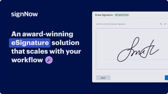
Award-winning eSignature solution

Send my document for signature

Get your document eSigned by multiple recipients.
Send my document for signature

Sign my own document

Add your eSignature
to a document in a few clicks.
Sign my own document

Move your business forward with the airSlate SignNow eSignature solution

Add your legally binding signature

Create your signature in seconds on any desktop computer or mobile device, even while offline. Type, draw, or upload an image of your signature.

Integrate via API

Deliver a seamless eSignature experience from any website, CRM, or custom app — anywhere and anytime.

Send conditional documents

Organize multiple documents in groups and automatically route them for recipients in a role-based order.

Share documents via an invite link

Collect signatures faster by sharing your documents with multiple recipients via a link — no need to add recipient email addresses.

Save time with reusable templates

Create unlimited templates of your most-used documents. Make your templates easy to complete by adding customizable fillable fields.

Improve team collaboration

Create teams within airSlate SignNow to securely collaborate on documents and templates. Send the approved version to every signer.

See airSlate SignNow eSignatures in action

Create secure and intuitive eSignature workflows on any device, track the status of documents right in your account, build online fillable forms – all within a single solution.

Try airSlate SignNow with a sample document

Complete a sample document online. Experience airSlate SignNow's intuitive interface and easy-to-use tools
in action. Open a sample document to add a signature, date, text, upload attachments, and test other useful functionality.

sample
Checkboxes and radio buttons
sample
Request an attachment
sample
Set up data validation

airSlate SignNow solutions for better efficiency

Keep contracts protected
Enhance your document security and keep contracts safe from unauthorized access with dual-factor authentication options. Ask your recipients to prove their identity before opening a contract to figma invoice template for administration.
Stay mobile while eSigning
Install the airSlate SignNow app on your iOS or Android device and close deals from anywhere, 24/7. Work with forms and contracts even offline and figma invoice template for administration later when your internet connection is restored.
Integrate eSignatures into your business apps
Incorporate airSlate SignNow into your business applications to quickly figma invoice template for administration without switching between windows and tabs. Benefit from airSlate SignNow integrations to save time and effort while eSigning forms in just a few clicks.
Generate fillable forms with smart fields
Update any document with fillable fields, make them required or optional, or add conditions for them to appear. Make sure signers complete your form correctly by assigning roles to fields.
Close deals and get paid promptly
Collect documents from clients and partners in minutes instead of weeks. Ask your signers to figma invoice template for administration and include a charge request field to your sample to automatically collect payments during the contract signing.
Collect signatures
24x
faster
Reduce costs by
$30
per document
Save up to
40h
per employee / month

Our user reviews speak for themselves

illustrations persone
Kodi-Marie Evans
Director of NetSuite Operations at Xerox
airSlate SignNow provides us with the flexibility needed to get the right signatures on the right documents, in the right formats, based on our integration with NetSuite.
illustrations reviews slider
illustrations persone
Samantha Jo
Enterprise Client Partner at Yelp
airSlate SignNow has made life easier for me. It has been huge to have the ability to sign contracts on-the-go! It is now less stressful to get things done efficiently and promptly.
illustrations reviews slider
illustrations persone
Megan Bond
Digital marketing management at Electrolux
This software has added to our business value. I have got rid of the repetitive tasks. I am capable of creating the mobile native web forms. Now I can easily make payment contracts through a fair channel and their management is very easy.
illustrations reviews slider
walmart logo
exonMobil logo
apple logo
comcast logo
facebook logo
FedEx logo
be ready to get more

Why choose airSlate SignNow

  • Free 7-day trial. Choose the plan you need and try it risk-free.
  • Honest pricing for full-featured plans. airSlate SignNow offers subscription plans with no overages or hidden fees at renewal.
  • Enterprise-grade security. airSlate SignNow helps you comply with global security standards.
illustrations signature

Learn how to simplify your workflow on the figma invoice template for Administration with airSlate SignNow.

Seeking a way to optimize your invoicing process? Look no further, and follow these quick guidelines to effortlessly work together on the figma invoice template for Administration or ask for signatures on it with our user-friendly service:

  1. Сreate an account starting a free trial and log in with your email credentials.
  2. Upload a file up to 10MB you need to eSign from your computer or the online storage.
  3. Continue by opening your uploaded invoice in the editor.
  4. Perform all the required steps with the file using the tools from the toolbar.
  5. Click on Save and Close to keep all the changes performed.
  6. Send or share your file for signing with all the needed recipients.

Looks like the figma invoice template for Administration process has just turned more straightforward! With airSlate SignNow’s user-friendly service, you can easily upload and send invoices for electronic signatures. No more generating a printout, signing by hand, and scanning. Start our platform’s free trial and it streamlines the entire process for you.

How it works

Upload a document
Edit & sign it from anywhere
Save your changes and share

airSlate SignNow features that users love

Speed up your paper-based processes with an easy-to-use eSignature solution.

Edit PDFs
online
Generate templates of your most used documents for signing and completion.
Create a signing link
Share a document via a link without the need to add recipient emails.
Assign roles to signers
Organize complex signing workflows by adding multiple signers and assigning roles.
Create a document template
Create teams to collaborate on documents and templates in real time.
Add Signature fields
Get accurate signatures exactly where you need them using signature fields.
Archive documents in bulk
Save time by archiving multiple documents at once.
be ready to get more

Get legally-binding signatures now!

FAQs

Here is a list of the most common customer questions. If you can’t find an answer to your question, please don’t hesitate to reach out to us.

Need help? Contact support

What active users are saying — figma invoice template for administration

Get access to airSlate SignNow’s reviews, our customers’ advice, and their stories. Hear from real users and what they say about features for generating and signing docs.

airSlate SignNow Review
5
Sunil

Using airSlate SignNow has been incredibly helpful in moving towards a paperless business model. The app is very easy to use, and the integration with most major cloud storage providers is a huge plus. Since adding airSlate SignNow to our business model, we've found that not only does it reduce the amount of paper that we need to keep on hand, but it's a huge benefit to our clients. The sophistication of providing them all their details signed, and in electronic format provides them with a stored and searchable document in their email, as well as impresses them in the process. If you frequently deal with needing to sign documents, I would highly recommend incorporating this into your business model.

Read full review
Love signnow!
5
Kim

As a landlord and a tv producer, I use sign now to quickly and efficiently send and get contracts signed. I've been able to eliminate the need to print a document, get it signed and then scan it in to digital archives. I can personalize a contract in minutes, specify the areas for people to sign, send the contract by email and receive it within minutes. I also love the template feature that allows me to upload one contract and send it to multiple users - each user signing and sending back the same contract. It saves me from redundant busy work ... can't stress enough the convenience and efficiency of sign now.

ease of upload, customizing documents, sending with alerts, verification of recipient, template feature

Read full review
The BEST Decision We Made
5
Laura Hardin

What do you like best?

We were previously using an all-paper hiring and on-boarding method. We switched all those documents over to Sign Now, and our whole process is so much easier and smoother. We have 7 terminals in 3 states so being all-paper was cumbersome and, frankly, silly. We've removed so much of the burden from our terminal managers so they can do what they do: manage the business.

Read full review

Related searches to Collaborate on figma invoice template for Administration with ease using airSlate SignNow

Figma invoice template for administration pdf
Figma invoice template for administration free
Figma invoice template for administration excel
Figma invoice template for administration free download
Figma invoice template for administration download
Figma invoice download
Figma quotation template
Figma invoice app
video background

Figma invoice template for Administration

are you curious about what separates top tier UI design that attracts clients and lucrative positions from junior level designs that struggle to gain you any sort of attention well the Gap isn't always as wide as you might think in fact it's likely that you already possess the skills needed to elevate your designs with just a few minor adjustments so today we're going to examine a range of UI design samples crafted by both novices and professionals to guide you on your journey towards becoming a First Rate designer [Music] let's start looking at some login screens moving from the most Junior up to the most senior levels of login screen design this first example with no disrespect is a very immature very unfortunate design and the reason that it is is because of the use of color there's probably other issues that you could talk about here in this design but if you just fix the color issues we're about to talk about it would 10x the effectiveness of this design what's the issues with the color it's just overusing our primary call to action color that color that pink right there could be a great color but it needs to be reserved for primary calls to action primary areas of concern we are using it and reusing it in every single area of the form the icon the text the outline of these input Fields we're not using any sort of dark text anywhere on this light background we got colorful headers and colorful links and colorful tertiary links down here and everything is just screaming at you the old old adage is that if everything is on fire then nothing is on fire and the firefighter doesn't know which area to address cuz they're all equally on fire in our usage here fire just means attention and we can't be separating or dividing our users attention by using color in this way if you fixed this usage of color it would fix the interface drastically let's look at another example that's using color in a much more mature way we're starting to leave behind those low levels of Junior design and start to get into that midlevel design design work here and they're doing color a lot better we're reserving our call to action color here this design actually struggles with a case of hierarchy issues right hierarchy here is pretty poor when we drill down the form actually looks pretty good here but we have some problems number one did you even notice that this was a link of course you didn't because there is no difference in the treatment of this text to the treatment of the placeholder text and the input and there's very little difference between the treatment of the label header here and the placeholder text there needs to be variation in this text maybe uppercase here maybe decreasing the opacity here maybe underlining or using some other sort of treatment so I know that this is a link with bad hierarchy and it only gets worse at the bottom of this design I have a big primary call to action button but I also have an equally weighted equally sized call to action button here to register this is why quite often we see these as a line of text or a text link that says don't have an account register here they've chosen to to challenge the user's perception of this and stop and guess am I supposed to click here am I supposed to click here and look how oversized the text is here we should be reading this in a hierarchy that says what you're here to do on this page is sign in here's the inputs to sign in here's what you need to do and secondary or maybe even tertiary if you can't sign in because you don't have an account there's some small text links down here this is an issue of hierarchy if you just change the hierarchy Consolidated the Styles and add some contrast between certain areas to create that hierarchy this design would be again 10x better and you'd start to move into more of these senior levels of design like we're seeing here this sign up form is much better we have very controlled use of color there's actually no color here but that's okay you don't have to have bright colors they're doing a black and white modern kind of treatment here that's totally fine my input Fields actually stand out from the background you can see I have good contrast between my placeholder active inactive and my text link that have different treatment I have one primary call to action here on the screen which I totally should have and I have a good secondary you might even call it a tertiary action instead of you know signing up you can already log in now the problem that this design has is just a simple one of proximity just some small spacing changes here might help it quite a bit we're actually grouping these items together really really well what we're not grouping together well is this lockup of icon with with a headline and some sort of sub headline I think what would really help is to put this inside of an auto layout in figma or something like that and give me some consistent spacing because right now it's almost as if this icon is close enough to make it seem like it's part of this group but it's not it it's not really same thing with our text it doesn't really feel like these two pieces belong together so let's just tighten those up and either separate the icon or the logo to be higher up or bring it together in the lockup to make it feel like one besides that this is a fairly decent Design This is the type of work that's hirable uh that's desirable that people would see in a portfolio but the last kind of tier to step up into that perfect login screen design here's a great example of that where we are doing a fantastic job of using Color hierarchy spacing layout bringing in some imagery so we don't have such a blah moment but instead we have kind of a powerful moment where everything is really really interesting again we are very specific and intentional on the use of color on the use of our call to actions we now actually have labels over here and they are a different treatment from our placeholder beautiful kind of like imagery some little subtle background color hints of gradients tertiary call to actions you have secondary call to actions in your big primary this whole flow is a very beautiful experience not only is it good user experience has all the good design principles being played out here but it's also visually spicy amazing this is senior level design and this is what we all should be shooting for and I'm telling you as you work your way up there's not that much difference between tweaking the color changing the hierarchy changing the spacing adding some visuals and bringing the whole thing together to go from Junior to senior level design all right let's dive in and take a look at some dashboard designs starting from the most Junior working our way up to the most senior examples here we have our most Junior example of a dashboard and the things that are happening here that could be improved to drastically change this interface design is really first again hierarchy there's a little bit of color usage issues here but mainly it's the emphasis being placed on the wrong thing when you're designing interfaces that are really really usable like dashboards that have graphs and charts and a lot of detailed information we need to clear out the design and allow the information to be the thing that's the focal point the focal point for me right now is this giant interface bar that I'm paying attention to and this giant muted uh sidebar over here on the left- hand side this is telling me my avatar the logo to this dashboard are really really important the word dashboard is really really important and look how much emphasis or focus is being put on the actual content I'm supposed to be using remember interface design is not necessarily like web design we are building tools and tools should be simple easy straightforward and sometimes even a little bit more boring so there's too much design being placed here for design sake and not a lot of care for our user and how they might use the interface they're probably not going to use this area and this area as much as they're going to use this area and this area so this is just an issue of focusing on the content that needs to be focused on let's take a look at our next example and this is an example of overuse of the brand color remember when we said you can't design interfaces necessarily like you design websites this is a very website thing where we use that brand color a lot we're hyper committed to that brand color but it's causing a lot of problems like first off my eyee is just confused there's no reason to use the brand color this much brand color does not have to be used in every pie chart every box every graph all of these charts whether they are at a high point a low point they all look the same to me they're just blending together so this is somebody who probably has some brand design experience or website design experience but has very little user interface design experience because all of these metrics all of these charts have value on their own but we're not focusing on the value that they can bring some other issues that we're having here are an issue of contrast like these notification bubbles right here they have really really bad contrast and you know why cuz we're hyper committed to this brand green they thought it must be this brand green so my notification bubbles that should be very helpful are now lost I can't see them and lastly we're going to have some issues with detached functionality I have a giant top bar up here and I'm not sure if this is supposed to be a button if it's supposed supposed to be just a statement but I definitely have this search button up here and I can't really tell if when I search if it's only going to affect things in this box or if it's going to start affecting things down here below also why is this notification up here taking up so much space increasing the size of this top bar and decreasing the space that I have to work with important content so we just have some issues hierarchy and overuse of that brand color and if you were to fix some of those issues and scale back the design and allow the content to do the talking for itself you might have an example of this more senior level looking dashboard we have Stripped Away a lot of the brand color we don't need it it's not about the brand while you're in here it's about the content and we're using color in a really thoughtful way the graphs here speak for themselves the colors punch and makes it pop out this allows the flags to speak for themselves the avatars of these people to speak for themselves I can see clear defined areas between this section of earnings and this section of top selling products but notice how I have reusable headlines and it's very very easy to track along same thing I have sections here sections here and it didn't necessarily need to widze everything which is put everything inside of a box because I've cleared out all that excess design work all that extra use of color I'm using areas in kind of like a nice modern way it's okay to have some sort of greeting here but notice how all of this content up here is really secondary it's taking a back seat to the main thing keep the main thing the main thing let our navigation be really really simple let our content do the talking if I was to nitpick at this design and just try to improve it I might say that we're taking up a little bit too much space they were a little bit hyper committed to having this whole box of the logo balanced with this box on the left hand side and it doesn't really need to be once we've moved into an interface it's not a branding moment anymore it's a moment for me to actually interact with the tool I don't want to know what brand of the hammer is I just want to start using the hammer when the time comes same thing with this logout bar I'm sure they were probably trying to match what they did on the top but I could just decrease that a little bit and that's going to help bring it that next little level of senior level design work let's look at one more that is fun interesting exciting and still has all of those good design principles we have good contrast here we have good separation of information I can tell that this search information feels very Global cu it's at the top with the rest of the global elements and I can tell that when I start to work with these filters and interact here it's only going to affect all the content directly in context of it same thing over here I have reusable patterns of these headlines with the body copy and the chips or tags that give me some sort of Legend detail here that are showing me the color the color punches it stands out right what's really really important seems to stand out here and I think that's okay now what's interesting about this interface and takes it to that next level of senior Des design is that it is a bit stylized and that's okay we have these heavy almost Neo brutalism drop Shadows they're thick they're bold they're on purpose and they're using them only in places where my attention should be like interactivity or large important charts but I'm not necessarily putting it in every single element so there's some very thoughtful design work happening here that is modern it's usable it's stylistic it's fun it's a nice interface and in my op opinion very very senior level so you can see the difference between these low levels these Junior levels into more of that midlevel and all the way up into those senior levels it's about addressing some of those Core Concepts remember your interface designers not brand designers you remember that you're going to really elevate your UI design work this video is sponsored by nordpass which is a way for you to organize your online Life as a freelance business owner I run my agency I run this YouTube channel I run a lot of things and I don't have have time to write down or remember all of my passwords so I use nordpass on my mobile device on my laptop in Chrome through the extension and it allows me to save every password secure encrypted and I can even share it with my team or anybody that I want to have access to it it is an awesome solution to secure your online life once you create a nordpass account you can log in and start adding new logins and accounts to nordpass so just put in the title the email the password you can even have Nord pass generate unique strong encrypted passwords for you just like that and then you fill in the website all the details boom save it away and you never have to think about it again you simply have to insert it from nordpass it's going to save you tons of time never let you forget a password encrypt everything to be secure and just run your business more efficiently so if you're interested sign up for Nord pass for a free trial there's a link down in the description definitely worth it definitely amazing now let's take a look at some examples of complex web applications we're going to be using some Concepts here that are very similar to Zillow or Airbnb they're complex web apps with lots of things going on let's start by taking a look at this first Junior example which actually is pretty good they're doing a lot of things right here I think the layout is actually not bad it's simple it's to the point they've controlled and used color wisely they're not overusing it or abusing it but some things that they could probably work on is the separation between main areas is it's probably just the assets they chose to use in the colors here a little bit hard because our sidebar feels a little bit muddy a little bit too close there's like not quite enough contrast between the section and then our map is really kind of gray scale very neutralized so it feels like it's also very similar there's not distinct areas here between map main content listing and sidebar navigation and that can be Troublesome I think they're also using that color uh on the price I don't think it's necessary and we have a real contrast issue here with certain areas like text size here is got to be like 8 pixels here as well it's 8 pixels or something and it's also very very light so if the details there are so light that you can't see them why even place them there we're having a trouble balancing color and contrast in this and you can tell that we're having trouble balancing color and contrast in this example because we are heavy on the drop shadow on pretty much everything this white treatment to this uh drop down probably for filtering options is probably not going to stand on its own so therefore they had to put a heavy drop shadow and that is a really good indicator when somebody doesn't know how to use color and contrast they start to add line separators they start to add too much drop shadow let's look at another example of someone who's not using as much excessive drop shadow but they're only almost going too far in the other direction we have a really dark sidebar and that's some sometimes can be okay but I feel like the contrast here on our inactive items is a little bit soft at least the alerts are popping through really really well but we have bad contrast on our logout there's no reason necessarily to have that log out be an emergency error red we usually reserve the colors red and bright green for success in error States these are called System colors and they're not being used correctly now I do like the use of side navigation kind of what we call Global navigation and now we have a local navigation I like how this is working you can see that as I start to update some of these filters here it's going to directly change some of the layout down below but again we're struggling a little bit with contrast and color usage again I don't think there's a need for the price to be our primary call to action let that live in the spots where it actually matters on these kind of navigation areas and also the outline of my card is so light I can't actually even tell from this distance that that outline is even there and so we're having some some of that separation issue between our background and this is really subtle this is why I would call that not a junior level design but a very midlevel of design they're doing a lot of things right here but they're just doing a few things wrong maybe the color usage the color Choice the contrast some of those things if you just tweak those and change those would start to move into senior level design like what we're seeing here in this example we're using a nice Punchy blue that probably in color theory represents professionalism trustworthiness this I probably want that when I'm looking for Real Estate so it's a better usage of color but you'll notice we're also Even in our neutral map we're pulling in some of those tones of blue we're doing things like primary and secondary using that blue and even tertiary icon buttons we're using that blue really really well and notice where we're not using it though inside the cards that have just that slight amount of contrast around them no drop shadow needed it's white on white and that's okay I'm not using blue on my price I'm not using using blue on my icons because they don't need to be but where that blue is really popping is in my main call to actions adding a listing and over here in my filter I do think that this is a better ux layout just across the board because we have some of that Global navigation here and what are people doing when they come to Real Estate websites they're probably filtering this is making a really complex interface so much simpler they don't have to open and close that functionality they chose to Omit that global navigation here on the left hand side now granted these might be for different use cases but this layout is just very very well done the color and the contrast between the map I don't need some sort of separating line it's enough that I can tell it's a nice crisp separation I have controls in here that are nice and Punchy and they're just using white they are using a little bit of Shadow you can tell but it's so subtle it's so mature I'm not using that same level of Shadow if any at all over on some of my filter controls so this whole thing is just very light the design is out of the way it's saying here's the content the tool is serving the content the tool is not serving the brand it's not serving the designer or exploration or doing something unique and interesting it's just nice solid UI design work that I would be proud to do I would be proud to Showcase and this is what senior level design looks like as you move back through little bit more cartoony not using those colors to really capture and separate maybe a little too far in the other direction too harsh bad use of those System colors into something that's really consistent really succinct really streamlined and very very mature well that's it those are some examples of moving on the scale from junior level design into midlevel and all the way up to those senior levels of design I hope you can really see that there's not a lot of difference it's just honing in on some of those basics of UI design and if you're interested in learning more on moving from junior level into becoming a UI Master then consider taking my 30-day UI design program the link is down in the description it teaches you all of this and you get to build multiple Capstone projects to actually execute and practice on all of these things you learn we talk about everything from color to spacing and hierarchy prototyping documentation handoff all of it check the link down in the description for 30-day UI but also I'd love to hear your thoughts on this video so leave those down in the comments check the description for a bunch of other helpful links and if you enjoyed this video make sure you leave a thumbs up subscribe to the channel I do lots of videos about design development and UI design stuff specifically so ring that Bell so you know when a new video comes out I hope you're having an amazing week I hope you're designing amazing things making amazing things and progressing your UI design work see you in the next one

Show more
be ready to get more

Get legally-binding signatures now!