eSigning Tag-Along Agreement Made Easy
Award-winning eSignature solution


Do more online with a globally-trusted eSignature platform
Outstanding signing experience
Reliable reports and analytics
Mobile eSigning in person and remotely
Industry regulations and conformity
Esigning tag along agreement, faster than ever
Helpful eSignature add-ons
See airSlate SignNow eSignatures in action


airSlate SignNow solutions for better efficiency
Our user reviews speak for themselves


Why choose airSlate SignNow
-
Free 7-day trial. Choose the plan you need and try it risk-free.
-
Honest pricing for full-featured plans. airSlate SignNow offers subscription plans with no overages or hidden fees at renewal.
-
Enterprise-grade security. airSlate SignNow helps you comply with global security standards.

Your step-by-step guide — esigning tag along agreement
Leveraging airSlate SignNow’s electronic signature any business can enhance signature workflows and sign online in real-time, supplying an improved experience to consumers and employees. Use esigning Tag-Along Agreement in a couple of easy steps. Our mobile apps make work on the run possible, even while off the internet! eSign documents from anywhere in the world and complete deals quicker.
Follow the stepwise guideline for using esigning Tag-Along Agreement:
- Sign in to your airSlate SignNow profile.
- Find your document within your folders or upload a new one.
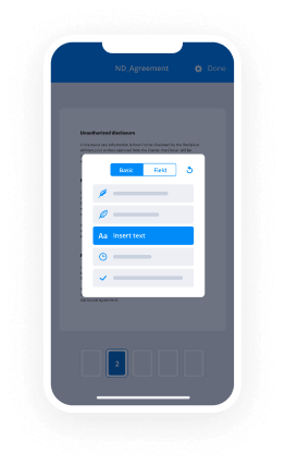
- Open the record and edit content using the Tools list.
- Drop fillable areas, type text and eSign it.
- Include numerous signers using their emails and set up the signing sequence.
- Choose which users will get an completed version.
- Use Advanced Options to restrict access to the document and set up an expiry date.
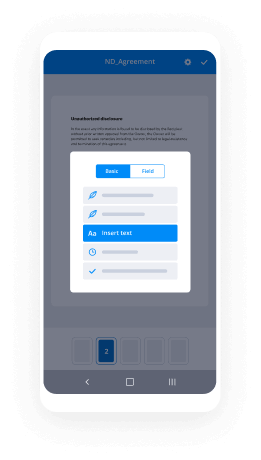
- Click on Save and Close when completed.
Additionally, there are more advanced features accessible for esigning Tag-Along Agreement. Add users to your common work enviroment, view teams, and keep track of teamwork. Numerous people across the US and Europe recognize that a solution that brings everything together in a single cohesive digital location, is what enterprises need to keep workflows working effortlessly. The airSlate SignNow REST API allows you to integrate eSignatures into your application, website, CRM or cloud storage. Try out airSlate SignNow and enjoy faster, easier and overall more productive eSignature workflows!
How it works
airSlate SignNow features that users love


See exceptional results esigning Tag-Along Agreement made easy
How to fill in and sign a PDF online
Try out the fastest way to esigning Tag-Along Agreement. Avoid paper-based workflows and manage documents right from airSlate SignNow. Complete and share your forms from the office or seamlessly work on-the-go. No installation or additional software required. All features are available online, just go to signnow.com and create your own eSignature flow.
A brief guide on how to esigning Tag-Along Agreement in minutes
- Create an airSlate SignNow account (if you haven’t registered yet) or log in using your Google or Facebook.
- Click Upload and select one of your documents.
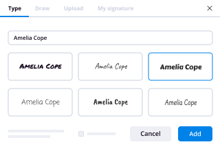
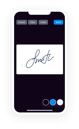
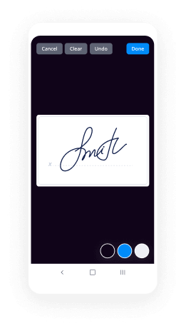
- Use the My Signature tool to create your unique signature.
- Turn the document into a dynamic PDF with fillable fields.
- Fill out your new form and click Done.
Once finished, send an invite to sign to multiple recipients. Get an enforceable contract in minutes using any device. Explore more features for making professional PDFs; add fillable fields esigning Tag-Along Agreement and collaborate in teams. The eSignature solution supplies a protected process and works according to SOC 2 Type II Certification. Ensure that your information are protected and that no one can change them.
How to eSign a PDF in Google Chrome
Are you looking for a solution to esigning Tag-Along Agreement directly from Chrome? The airSlate SignNow extension for Google is here to help. Find a document and right from your browser easily open it in the editor. Add fillable fields for text and signature. Sign the PDF and share it safely according to GDPR, SOC 2 Type II Certification and more.
Using this brief how-to guide below, expand your eSignature workflow into Google and esigning Tag-Along Agreement:
- Go to the Chrome web store and find the airSlate SignNow extension.
- Click Add to Chrome.
- Log in to your account or register a new one.
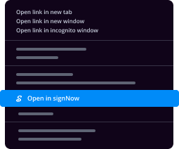
- Upload a document and click Open in airSlate SignNow.
- Modify the document.
- Sign the PDF using the My Signature tool.
- Click Done to save your edits.
- Invite other participants to sign by clicking Invite to Sign and selecting their emails/names.
Create a signature that’s built in to your workflow to esigning Tag-Along Agreement and get PDFs eSigned in minutes. Say goodbye to the piles of papers sitting on your workplace and begin saving money and time for extra essential tasks. Selecting the airSlate SignNow Google extension is an awesome convenient choice with lots of benefits.
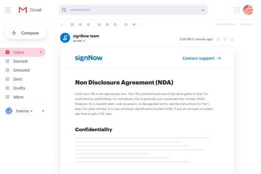

How to eSign an attachment in Gmail
If you’re like most, you’re used to downloading the attachments you get, printing them out and then signing them, right? Well, we have good news for you. Signing documents in your inbox just got a lot easier. The airSlate SignNow add-on for Gmail allows you to esigning Tag-Along Agreement without leaving your mailbox. Do everything you need; add fillable fields and send signing requests in clicks.
How to esigning Tag-Along Agreement in Gmail:
- Find airSlate SignNow for Gmail in the G Suite Marketplace and click Install.
- Log in to your airSlate SignNow account or create a new one.
- Open up your email with the PDF you need to sign.
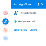
- Click Upload to save the document to your airSlate SignNow account.
- Click Open document to open the editor.
- Sign the PDF using My Signature.
- Send a signing request to the other participants with the Send to Sign button.
- Enter their email and press OK.
As a result, the other participants will receive notifications telling them to sign the document. No need to download the PDF file over and over again, just esigning Tag-Along Agreement in clicks. This add-one is suitable for those who like focusing on more important goals as an alternative to wasting time for practically nothing. Improve your daily routine with the award-winning eSignature solution.
How to sign a PDF on the go without an app
For many products, getting deals done on the go means installing an app on your phone. We’re happy to say at airSlate SignNow we’ve made singing on the go faster and easier by eliminating the need for a mobile app. To eSign, open your browser (any mobile browser) and get direct access to airSlate SignNow and all its powerful eSignature tools. Edit docs, esigning Tag-Along Agreement and more. No installation or additional software required. Close your deal from anywhere.
Take a look at our step-by-step instructions that teach you how to esigning Tag-Along Agreement.
- Open your browser and go to signnow.com.
- Log in or register a new account.
- Upload or open the document you want to edit.
- Add fillable fields for text, signature and date.
- Draw, type or upload your signature.
- Click Save and Close.
- Click Invite to Sign and enter a recipient’s email if you need others to sign the PDF.
Working on mobile is no different than on a desktop: create a reusable template, esigning Tag-Along Agreement and manage the flow as you would normally. In a couple of clicks, get an enforceable contract that you can download to your device and send to others. Yet, if you really want a software, download the airSlate SignNow mobile app. It’s comfortable, quick and has a great design. Enjoy easy eSignature workflows from the office, in a taxi or on a plane.
How to sign a PDF file using an iPhone
iOS is a very popular operating system packed with native tools. It allows you to sign and edit PDFs using Preview without any additional software. However, as great as Apple’s solution is, it doesn't provide any automation. Enhance your iPhone’s capabilities by taking advantage of the airSlate SignNow app. Utilize your iPhone or iPad to esigning Tag-Along Agreement and more. Introduce eSignature automation to your mobile workflow.
Signing on an iPhone has never been easier:
- Find the airSlate SignNow app in the AppStore and install it.
- Create a new account or log in with your Facebook or Google.
- Click Plus and upload the PDF file you want to sign.
- Tap on the document where you want to insert your signature.
- Explore other features: add fillable fields or esigning Tag-Along Agreement.
- Use the Save button to apply the changes.
- Share your documents via email or a singing link.
Make a professional PDFs right from your airSlate SignNow app. Get the most out of your time and work from anywhere; at home, in the office, on a bus or plane, and even at the beach. Manage an entire record workflow easily: create reusable templates, esigning Tag-Along Agreement and work on PDF files with business partners. Turn your device into a potent business tool for closing deals.
How to eSign a PDF using an Android
For Android users to manage documents from their phone, they have to install additional software. The Play Market is vast and plump with options, so finding a good application isn’t too hard if you have time to browse through hundreds of apps. To save time and prevent frustration, we suggest airSlate SignNow for Android. Store and edit documents, create signing roles, and even esigning Tag-Along Agreement.
The 9 simple steps to optimizing your mobile workflow:
- Open the app.
- Log in using your Facebook or Google accounts or register if you haven’t authorized already.
- Click on + to add a new document using your camera, internal or cloud storages.
- Tap anywhere on your PDF and insert your eSignature.
- Click OK to confirm and sign.
- Try more editing features; add images, esigning Tag-Along Agreement, create a reusable template, etc.
- Click Save to apply changes once you finish.
- Download the PDF or share it via email.
- Use the Invite to sign function if you want to set & send a signing order to recipients.
Turn the mundane and routine into easy and smooth with the airSlate SignNow app for Android. Sign and send documents for signature from any place you’re connected to the internet. Build professional PDFs and esigning Tag-Along Agreement with a few clicks. Assembled a faultless eSignature process using only your smartphone and increase your overall productivity.
Get legally-binding signatures now!
FAQs
-
What is a tag along clause?
Tag-along rights also referred to as "co-sale rights," are contractual obligations used to protect a minority shareholder, usually in a venture capital deal. If a majority shareholder sells his stake, it gives the minority shareholder the right to join the transaction and sell their minority stake in the company. -
What is the difference between tag along and drag along?
What are Your Rights? The drag along clause requires the minor to sell their shares, while the tag along clause requires the majority shareholder to allow the minor to join in on a sale. Both clauses give to the minor the rights to receive the same price, terms and conditions as any other seller. -
What are co sale rights?
Also called tag-along rights, co-sale rights allow minority shareholders to sell their stakes in a company if a majority shareholder wishes to sell its stake in a company. -
What is minority shareholder?
Minority shareholder is a shareholder who owns less than 50 percent of the total shares of a corporation's stock. A minority shareholder does not have the voting control of the corporation; neither can s/he single-handedly elect the directors of the corporation. -
How do I get rid of a minority shareholder UK?
Share transfers. Transferring the ownership of limited company shares can be done through the sale of the shares or the gifting of the shares to other people. ... The death of a shareholder. ... Shareholder disputes. ... Minority shares. ... The register of members. ... Companies House. -
How do I get rid of a minority shareholder?
Removing a minority shareholder will be simplest if you have a well-drafted shareholder's agreement. Such an agreement will usually stipulate that the majority shareholder can buy out the minority at a predetermined price, or at a price determined by a mechanism specified in the agreement. -
What is a subscription and shareholders agreement?
A share subscription agreement (Share Subscription Agreement) is a promise by a potential shareholder, also known as a subscriber, to make payment of funds to a company (Company) in an agreed number of \u201ctranches\u201d, in return for the Company issuing and allotting a certain number of shares at a certain price, such that ... -
What is included in a shareholders agreement?
A shareholders' agreement includes a date, often the number of shares issued, a capitalization (or \u201ccap\u201d) table, outlining shareholders and their percentage of company ownership, any restrictions on transferring shares, pre-emptive rights for current shareholders to purchase shares (in the event of a new issue to ... -
What is a subscriber agreement?
Subscriber Agreement Law and Legal Definition. Subscriber agreement means an electronic signature agreement signed by an individual with a handwritten signature. -
How much does it cost to draw up a shareholders agreement?
The legal fees associated with the preparation of the shareholders' agreement vary in direct proportion with the complexity and comprehensiveness of the agreement. Very basic agreements can cost as little as $2,000 and more comprehensive shareholders' agreements can cost $10,000 and upwards. -
What is an investor agreement?
An investment agreement is an agreement between a company and individuals wishing to purchase an ownership in the company. The purchaser may be an existing shareholder or outside investors. ... It generally requires vote of a specified number of percentage of shareholders to take the action. -
How do I get rid of unwanted shareholders?
Refer to the shareholders' agreement. A shareholders' agreement outlines the rights and obligations of each shareholder in an organization. ... Consult with professionals. ... Claim majority. ... Negotiate. ... Create a non-compete agreement. -
What is a fair percentage for an investor?
Angel investors typically want from 20 to 25 percent return on the money they invest in your company. Venture capitalists may take even more; if the product is still in development, for example, an investor may want 40 percent of the business to compensate for the high risk it is taking. -
How do you force a minority shareholder to sell shares?
Shareholder Agreements The same agreements protect minority shareholders by forcing the company to buy their shares if they choose to sell out. In a well-structured buy-sell agreement, the offer by an outsider to purchase the company should allow a shareholder to counteroffer. -
Do all shareholders need to sign a shareholders agreement?
Sometimes it is neither appropriate nor necessary for a shareholders' agreement to be signed by every shareholder. For instance, a shareholders' agreement may cover just voting rights and only need to be signed by members of the same family to ensure control is retained by one particular member of that family.
What active users are saying — esigning tag along agreement


Related searches to esigning Tag-Along Agreement made easy

Esigning tag along agreement
hey guys welcome back to my channel so um today we will be looking at another portfolio review and um this portfolio is created by a ux designer called fenway and fenway is currently a two year two masters student studying information management at the university of washington and the phone way is specializing ux and information architecture so um yeah let's take a look at phoneways portfolio and see what we can learn from it okay just a quick reminder so i share everything about ux from interviewing tips to portfolio reviews um design critics on my youtube channel so if you are interested on those content please feel free to hit the subscribe so you won't miss any of my future content okay let's do it we are looking at um the landing page of this portfolio um overall it looks the visual looks very nicely designed and the color coordination and overall it looks like simple but professionally done let's take a look at a structure first so um there is a header with the designer's name or logo and on the right hand we have menu let's see if i tap on the menu it opens up to a couple of options from about me and projects um and there is a little blurb hi this is fun way hands portfolio please contact me okay basically the ways to get in touch with smallway and i think this structure is fairly straightforward where you have the basic but necessary um fundamental elements that usually i will be looking for in a designer's portfolio which are projects about me and a way to get in touch with you one minor critique is the how this opens up menu works this i think the hamburger menu it works well when it is like on mobile you're trying to save space so you try to condense the um options actually visible on the surface level however on the web view um you know i think especially when those you don't have really too much elements to show right you only have about me projects and potentially maybe a contact message so i would um suggest considering like taking those options from hidden ender menu to the surface level so you know the hiring manager will be able to see go right away if they want to look at about me or look at projects there's one step away rather than digging with into a hamburger menu um then we have the section of projects uh looks like there are three projects laid out here um and a very nice hero image i have to say i think the color uh extraction or maybe the background like the suction of the visual treatment makes it look super easy to look at and very visually appealing and let's see what's in this card so there's a call to action button that you can take click to view more details about the projects and on the top there says produce marketplace i think this is probably the name of the product designing online grocery shopping experience for senior citizens i love this this one line is really explaining what is the problem that this designer is solving for and on the top there is service design ideation design method i guess this is kind of touching on the scope or what kind of bros phoneway has been like serving as like when designing on this product what is the designer throw so overall like just quick overview i think this card is very nicely done the information structure is super clear like the most like prominent uh element being the name of the product and the call to action to view projects with a subtitle about really explaining the problem statement or what this product is about what is um the designers working on so this makes it very easy to read without like trying too difficult to figure out oh should i do i want to look at this product or not um one thing i do notice is like okay amount of three different projects here it seems like all of those are web platform or at least the prominent image here seems like talking to me okay this is what product second one and third one is as well um i realized there is a slight like a small like mobile mock over here for the second project the merlin banking system um so i'm not sure maybe that is both uh designed on a web and mobile platform so yeah in case you are interviewing or looking for positions or opportunities uh more focused on mobile platforms you might wanna kind of adjust how you present and also if you have actually more on the mobile app design experience um i'll try to mix the visual for the cover page over here just so it looks like you do have the experience of working on both platform okay with that being said i'm gonna go ahead and click into the first project like we always do and take a look at the details of this first uh project or case study produce marketplace okay so now we are looking at the project details page for produce marketplace with those nice avocado image and uh and the hero image um okay what is this designing online grocery shopping experience for senior citizens this was already well stated on the landing page um before i continue just one one thing uh minor critique on the hero image here you know um totally up to you whatever image you want to feature in a hero image visualize this looks nice however second thing i noticed is the text over here is kind of random rather than a finalized copy um so that makes you know makes it looks a little bit unpolished if you want to show a final uh design which this high fidelity mockup looks like it is close to a final like high fidelity uh marks right and in that case i think it will serve a better purpose um if you can put final copy or at least more of a close to complete copy rather than placeholder for the text um so how rip do you like your avocados this is good but then my second thing i look at is the second line and it looks like it's a placeholder so minor critique on the copy um now let's take a look at um what's in the project story okay it talks a little bit about what's the background we want to do something for the senior citizens instead of going to nursing home uh okay so this is basically the background of the project i love this section which has duration team rose and sector i think this always help super helpful to um you know give the audience some very high level uh guidance on what is the project look like timeline euro and what have you worked on then it goes into discovering design opportunities okay starting from questions i guess this is probably the part of research to define or discover the problems aggregating results research result after the interview we did affinity maps and then helped us uh finding and allow us to focus on the discussion are the most important insights this is very concise and along with the visual i think it serves the purpose very well we found some interesting pattern and affinity diagram and then it lays out into most of them prefer going to physical store for a few common reasons okay then it goes into those bullet point what are the key reasons i guess explaining why the users uh prefer to go into a physical store they like to touch and feel the product like to have social interactions and so on then at least to the conclusion we came to conclusion that quality sensory and social aspects of shopping in store are the most important factors to many participants i think this is very nicely done it did not go into too much detail of the research detail but going into the conclusion what is the finding which is exactly i think is the key part of information as a hiring manager for ux designer will be looking for then it goes into analyzing user journey okay it looks like the designer did like was posted and did more analyze of the user journey map and visualize how the current online grocery shopping look like from there defining the target users were surprised by the research result some reflections and trade-offs yes but users okay looks like there are some personas done over here to help really understand what are the key problem framings then it goes into okay there are some visuals here addressing problems and needs well let's set down all the pain points and charges regarding senior people's online grocery shopping experience and use the value prop canvas to facilitate the great brainstorming activities and came up with the key features to address the major points i think the copy is very nicely done this is you see the really a concise and clear way to explain why you did what you did and how that leads you to the next step of the design process rather than putting just the modules or examples like a typical ux project how the process would lay out here this designer did a really good job at explaining you know by listing the pain point and you know understanding the persona and their current online grocery shopping experience that helped the designer come up with the key features the top priorities to address the major pain points so you know you see the story here it's very well connected okay from this diagram value prop to customer profile then it comes into okay i guess those are probably the major pain points we are shopping making of the sensory aspect of online shopping produced directly from farmer build trust online community and expert advice encouraging social interactions i see those looks like the key things that the use of the designer decided to focus on uh to address the pain points so then we go into more secondary research what is secondary research reflections on the timing of secondary research if given a second chance i'll do this at the very first okay luckily it's not too late to do some secondary research and found out many results are aligned with our interviewing result okay i see so this is talking about um you know i guess because at the beginning the designer conducted more of a qualitative research at a later stage they decided to do it more of a quantitative perspective have more um detailed questions and uh okay to address the interview based on both quantitative and quality i see okay so and you know instead of calling it secondary research i would probably reward how you however you name it because this looks like you know it's still part of the research it's just you decided to use a different method to help you gain quantitative data and if that's the case you don't have to word it like you know secondary research make it sound a little bit like in addition or not as important which is probably not the case over here so um and in terms of how much details you go into i think it's helpful probably show some of the diagrams over here uh with some key um explanation of what does it explain to me like for example various preventing ordering groceries like this diagram what you're finding from here to me looks like it's not clickable or at least i can't click to zoom in i can't really see much details in this diagram um so maybe it's helpful to have a conclusion i don't know if this line is is the conclusion cost remains the biggest hurdle with close to 70 percent of shoppers who have not bought groceries online signing high delivery and service fees are major obscure obstacles and then there is another paragraph talking about quality concerns and desire to handpick their own foot then there is another diagram the frequency of in-person grocery shopping frequencies okay and then there's a line talking about being health-conscious impact shopping habits so i'm having a little bit hard time to understand okay what's got what's the connection or is there any connections between the diagram showing here and the text drawing below it looks like it there might be but i can't see direct relations over here for example the diagram i'm looking at here is the frequency of in-person grocery shopping but it looks like there's different type of stores and different frequencies but what's the conclusion you landed on after seeing this data being healthy conscious impact shopping i'm not sure if this line below or the paragraph below actually explains you know what's revealed in this diagram so i think there are things you can improve on here to make the story a bit more stronger to make it stronger and clear by either have a line right attached to the diagram explaining what is this diagram and what's your finding from that if the paragraphs are not directly related to the diagram maybe you can group the text together um or however way you want to show it you know anyway the key point here i have is to be clear and address what you want to communicate by showing those diagrams by looking at the diagram itself you know you can't rely on the audience or the hiring manager try to understand and take like oh what what does this designer mean um on the other hand if you can give them really clear message um what does this diagram help you learn or find out and that will be super helpful and show your clear logic and design thinking then we have design designing experience as a whole i don't know what is this problem solution is this like a whiteboard uh not sure there are a couple of panels over here overall kind of two a little bit too small the text is almost too small to to actually for me to see the details um not quite sure what's the purpose of showing this again this might be helpful to have a little bit context why you are showing this and how does this help you having the lean canvas allowed us to think about not only the product itself but the experience of the whole service provided okay i guess there are some connections but again the visual presentation up here either you can make the tax bigger so it's actually you know uh legible uh or use some other video presentations to communicate what is the message here for me just looking at this i'm having a hard time to understand why you're showing me this and how does that help you um so yeah just a minor critic on that then we have thinking about unique ways to address the problem innovative business model okay i'm gonna skip this refining the entire service okay is that like um information architecture looks like again this is something might be really interesting but i can't okay if i looks like if i click and hold my mouse i can actually see it zoom in but uh yeah i can't really click to get a larger view and stay on that view to look at it um which i i don't know i think this might be something really valuable so you might want to find out a way to visually present it like either in a larger view to make the audience can actually look into the details if they want or tweak the visual itself so it's more visible then we have prototyping experience desktop first how do we design our website to be responsive we did the project for the web why what first because usually you know like when you do responsive design like there's usually a mobile first uh approach which has typical so you can focus on what's the most important information um okay here the designer actually explained the reason because our research suggested users in the senior market prefer to using desktop when shopping online because they can see the product in larger details this is great so when you make a decision on something for example desktop first give the reason behind um so you know the audience can easily understand why um and the motivations then there's highlights of the prototype large rage photos emphasizing quality of product okay honestly when i look at here when it gets to prototypes i'll probably go right into the visual rather than read any of the text over here um so let's see it looks like this is a figma file maybe okay great i can actually zoom in and see the larger the expanded view so looks like this might be the landing page there are a couple of months again without zooming in it's kind of hard to tell okay i'm guessing the first one i'm looking at is the landing page the second looks like it's your their home market fruits and looking at avocado looks like maybe i'm trying to select the avocado then there's community recipe there are two pages of community recipe talking about okay this is really interesting need ideas for dinner okay and then there's shopping cart and checkout okay this probably is more of the payment checkout page so one thing um obviously i would suggest here is have a label it's really i think when you are so deeply involved in a project it might be hard to see it but you know as a viewer here uh i don't know what the page i'm looking at you know so if you give it a simple label call it homepage or landing page then this is shopping this is recipe trying to get inspirations and last one is checkout that will be like super helpful i think to get a sense of what the page i'm looking at um yeah and again like when you show those high fidelity visuals i wonder if you can use some visual indications to highlight why you come to certain design solutions um okay let's see large rich photos emphasizing quality okay produce can be selected according to personal preference you see those are actually the good bullet points that i was looking for but again i think by looking at the text over here i can't remember everything or it's kind of not convenient for the audience to actually remember and connect on their own okay why see the text and then see the visual which text or which part of the visual is related to the tags you have here for example a community recipe section allows shoppers to share the recipe and add ingredients to their shopping cart in one click by showing the text over here and the visuals in a different place where i will be looking in full screen mode it's very easy for the audience to get lost and missing those kind of really critical information so how about you know i would encourage you to think about um by showing like what's the point you want to show here the community recipe section allows shoppers to share recipes and adding grazing to their shopping cart in one click where is this in your visuals or how does this step how can a user get the step accomplished and the website you're designing for can you use some annotations or call out the areas in the visual and showing maybe some tags over there like anyway like the point is you know right now i'm having a disconnections by reading the text and the visual and a lot of the case i might just skip the text itself so if i look at the visual itself how could you help the audience your audience which might be the hiring managers over here to better understand what you're trying to communicate so that's i think um one of the most critical things that i have been noticing in many different designers portfolio is there is a disconnection of showing visual mock-ups or the final prototypes showing the pretty screens versus explaining your story like how did you lend on to certain solutions and why okay now followed by that we have passing the prototype do it rapidly there's a video prototype and use what is the video i'll probably look at that later uh user feedback uh we ask the user to fill up a lightweight journey map in order to know which steps do you remember and the user in experiencing those steps uh i guess this is probably part of validation testing user describing his experience cool there's actually a video included here so if i want to see the details i can go ahead and watch the video um let's see if there's any summary of the fighting key findings okay there's a section called learnings and reflections there are always some constraints in the projects result of the research can be very different from initial assumptions cool so at the end there are the summary this section showing the designers learning and reflections um designing solutions to improve people's life is always why i'm passionate about ux cool i remember okay at the end there's some personal touch on why the designer feels passionate about this type of project and last not the least really appreciated help from the interview participant okay cool so this is looks like the ending of this project or the case study i think overall the flow works very nice it started with research let's go back to the top so it started with a very clear problem statement with the visual and you the designer's role and introduction based based information about the project then going into discovering the problem um what kind of research that you the designer has done um then goes into the user journey defining user problem you know overall i think the storytelling here is great however the portion that spent on research seems a little bit heavy compared to how much content being shown at the end about design so depends on what well if you feel really passionate about research or potentially open to like applying for ux researcher position to that makes sense to highlight more on the research however if the cases you're looking for opportunities more as a ux designer or product designer i would try to condense the side you spend on research here a little bit and probably two strands and add a bit more when it comes to design and starting from here addressing problems and needs this is still like i think framing the problems and secondary research you see you know looking at the progress bar i'm already past the halfway of the project and i'm still looking at research um and then it goes into the actual design you know how you you know like approach the problems here you know i think this for example if you're doing like any type of information architecture or user flow i would put some focus on that and talk about the story over there how does that help you before you land onto the final highlights of the high fidelity prototype and again here when it comes to the high fidelity prototype don't just end it there back to my point um you know try to this is probably the one of the most important sections i think when i evaluate ux designer from hiring managers view so you want to show not only the best part of your visual your work but also explain clearly why you come to certain solutions and how you landed on that solution um so at the end i think it's great um here the designer has included more of the learning and reflections but on the other side you know i'll try to include some results or number data to indicate what's your design impact um you know even though this might be not a launched product you mentioned that there are some research done at the end to gain try to understand user feedback so from there if you have any data that can you know prove your redesign or your design how does that solve the problem i think to have an any kind of proof data to help at the end will help support your story um to explain especially what's the design impact and a lot of the case you know as a us designer we're designing not only to solve user problem but also have a business mindset what is the business outcome and how to drive the success of the business so that's another perspective you can touch on and especially when you're talking about the summary learning and reflections so i think that can make it even even better or stronger sorry um but overall i think this is a pretty well done uh project case study now let's um at the end like we always do i'll go back to the home page and take a look at the about me cool nice picture and hi this is norway i'm a second year student studying user experience and information architecture at the university of washington okay nice this is talk a little bit add a little bit personal touch about who you are what you do and what do you feel passionate about and i love that there is also a clickable link to uh download from waste resume i am a problem solver advocate craft craft smell like designer i love those illustrations i think those cards are very neat and it's very visually like it communicate it communicates who you are and in a very concise way in terms of the visual hierarchy as an audience i can very easily grab what you want to say here and who what you feel passionate about cool i think this is a um very well done about me section um minor critique all things you can prove is probably this paragraph you know talk about who you are i think here maybe if you want to highlight on any keywords for example you your students study user experience and information architecture maybe just for example if you want to highlight the keywords of you user experience and information architecture you can use a different color or build the text just to give it a little bit guidance um you know what are some of the highlights if i don't feel like reading a long paragraph what are the key words you want to grab um the audience attention so that's all we have for today um there will be more portfolio reviews coming up and if you have any comments any thoughts on things you would want to suggest on this portfolio or other topics you would like to hear more please leave me a comment i would love to hear from you guys i will see you next time thank you bye
Show moreFrequently asked questions
How can I eSign a contract?
How do you add an eSignature to a PDF?
How do I insert an electronic signature box into a PDF?
Get more for esigning Tag-Along Agreement made easy
- Print signature service Inventory Checklist
- Prove electronically signing Plumbing Proposal Template
- Endorse digi-sign Barter Agreement Template
- Authorize signature service Code of Ethics
- Anneal signatory Product Quote
- Justify eSignature Pet Addendum to a Lease Agreement
- Try initial Project Proposal Template
- Add Administration Agreement signature block
- Send Project Proposal Template signature service
- Fax Wedding Photography Quotation countersign
- Seal Teacher Evaluation Survey signatory
- Password Letter of Undertaking initials
- Pass Editor Contract Template eSign
- Renew Codicil to Will esigning
- Test Powerlifting Event digisign
- Require Roommate Rental Agreement Template electronic signature
- Comment visitor mark
- Boost teller electronically signing
- Compel self sign
- Void Monthly Timesheet Template template signature
- Adopt protocol template email signature
- Vouch Product Order template signatory
- Establish Rail Ticket Booking template electronically signed
- Clear Royalty Agreement Template template byline
- Complete Client Progress Report template esigning
- Force Architecture Firm Proposal Template template esign
- Permit Graphic Design Order template signature block
- Customize Event Photography Contract Template template signature service